BLOG
When Signage Stops Being an Afterthought

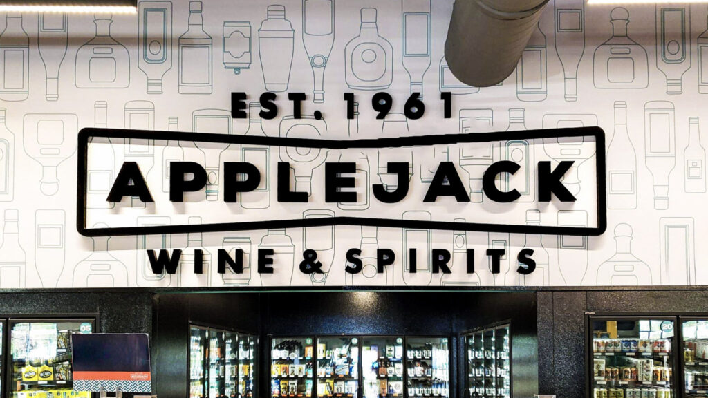
The Unassuming Powerhouse
Signage often gets treated like décor, something you “hang up in the end”. But at the core of it, it’s more like a wallflower in the business world. The sweet, awkward, unassuming type with way more to offer than people realize. Once in place, signs become your hardest working brand channel: always on, always visible, quietly teaching people who you are and where to go. When treated like a brand asset rather than an afterthought, turn daily drive-bys into recognition, and recognition into choice. With our simple three step plan… but seriously, keep reading, and we’ll help explain why smart signage helps!
Always On, Always Visible, Quietly Teaching
Always on: your 24/7 brand channel
Unlike ads that start and stop, signage never clocks out. It works in the background, every hour, every day, stacking impressions without ongoing media spend.
Why it works…
- Persistent presence: Your signs sit on the same corner that commuters pass 40+ times a month. Each pass is a no-cost impression.
- Day–night continuity: Proper lighting and materials keep your brand visible and eye-catching, whether at noon or at 9 p.m.
- Positive Vibes: A sign that’s lit, clean, and well-maintained broadcasts “We’re open! We’re dependable!” even if you’re still trying to find your groove on social media or through SEO.
Design moves that amplify “always on”
- Specify letter height/lighting for night first (that’s when contrast is hardest).
- Choose finishes that resist fade and grime; set a simple routine to get that cleaning and inspection cadence going.
- Provide a reinforcing message through an interior sign, like a dimensional logo or feature wall, so when your customers step inside they feel the continuity of your brand.
Always visible: built for human and street scale
Your sign lives where decisions happen! At eye level, in traffic, at a doorway, or at endless other locations, these impressions become inherently more noticeable and personal than a thumbnail in in a never-ending social media feed.
Why it works…
- Scale + sightlines: Sized for distance and approach speed, your signs can be read in a few seconds from a car or sidewalk.
- Contrast + simplicity: High contrast and fewer words win the glance.
- Placement that teaches the eye: When identity, arrows, and entry cues appear in predictable places, customers spot them faster. People remember places that are easy to navigate and associate negativity with those that are confusing or difficult. Let’s make it easy for your customer to find you!
Design moves that amplify “always visible”
- Use the 3-second drive-by test- if you can’t read it clearly in three seconds increase size or contrast and simplify the content.
- Standardize predictable placements (e.g., logo left, arrow right; hours at eye level on the right-hand door).
- Add a perpendicular blade sign on pedestrian streets to catch side-approach traffic.
Quietly teaching: the brand lessons people absorb by passing by
Every exposure teaches and reinforces a tiny, subliminal lesson: your name, your look, where to enter, where to queue. Those “lessons” add up!
Why it works…
- Pattern recognition: Repeating the same typography, colors, and placements builds a mental file, “Oh, that place!”
- Wayfinding cues: Small, timely instructions (“Enter here,” “Pick-up →”) reduce hesitation and make the experience feel easy.
- Quality cues: Material and choices style choices (brushed aluminum, acrylic, dimensional, or flat cut out letters), all quietly say “this brand is thoughtful and premium.”
Design moves that amplify “quiet teaching”
- Keep one job per sign– focus on what people need to know now and move more detailed info to the next decision point.
- Pair icons with short verbs (turn here, walk straight ahead), icons speed scanning while verbs prevent misreads.
- Create a tiny ADA/compliance kit to maintain consistency (type, contrast, mounting heights). This helps regulatory signs reinforce your brand while maintaining compliance.
How drive-bys become recognition, and recognition becomes choice
Step 1: Daily drive-bys → recognition
Repetition + consistency + context = memory. Your exterior identity creates the first mental bookmark. Window and other entry cues confirm it and your interior mark seals it. Over time your brand’s name, look, and location stick.
But how can we make it work faster?
- Bigger letters and higher contrast choices grab attention better and make your sign easier to read even when your customer is speeding by.
- Night lighting that is vibrant and crisp draws attention to your brand and location. Washed out images or poorly constructed signs rarely get a second glance.
- A clear threshold cue (“Enter here”) visible from the curb, draws people in.
How you know it’s working
- Customers say, “I drive by all the time, finally stopped in.”
- Engagement across other platforms show that your customers are curious and what to know more.
Step 2: Recognition → consideration
When a need arises, people choose familiar options first. Clear branding and imaging lowers friction. And when people see your brand easily, they act on that familiarity and engage, instead of bouncing to the next option.
But how can we make it work faster?
- A simple approach sequence: identity at distance → entry cue → first decision sign.
- Reassurance markers (“You’re in the right place”) at long corridors or after turns removes hesitation and doubt.
- Consistent interior branding that telegraphs “organized and trustworthy,” and “you’re in the right place,” reduces anxiety and confusion.
How you know it’s working
- Fewer “Where do I go?” questions for staff and faster queues for customers results in less frustration, which is SO much better for everyone!
- Higher walk-in or call-in volume after exterior/interior refreshes are a clear sign (pun kind of intended) that your customers are engaging.
Step 3: Consideration → choice (and advocacy)
Easy navigation + cohesive brand cues make the whole experience feel intentional. People choose what feels clear and comfortable, and they generally recommend things to others that feel effortless.
But how can we make it work faster?
- One action per location (“Check in,” “Order here”) help streamline your processes and guide your customers to the next step.
- A memorable interior mark that doubles as a photo backdrop. “Look, I was here! It was awesome!” creates interest beyond the initial impression.
- Clean, well-lit signs show people you care and that your brand values the small details.
How to tell it’s working
- Repeat visits and word-of-mouth (“Meet me at the sign with the neon script”).
- More photos tagged in front of your feature wall or exterior letters promote engagement across platforms and help expand your customer base.
The takeaway
Signage is always on (working without media spend), always visible (ready the moment decisions happen), and always teaching through repeated, consistent cues. Do these three things well, and daily drive-bys become recognition, recognition becomes choice, and choice helps your business grow.
Ready for the glow-up? Let your wallflower take center stage! We’ll do a quick walk-through, run the 3-second test to make sure your brand is visible and communicating your message clearly, then make few initial recommendations that show the world your signs aren’t just “nice”, but an absolute “can’t miss”. Always on, always visible, quietly teaching, and bringing main-character energy to your brand.